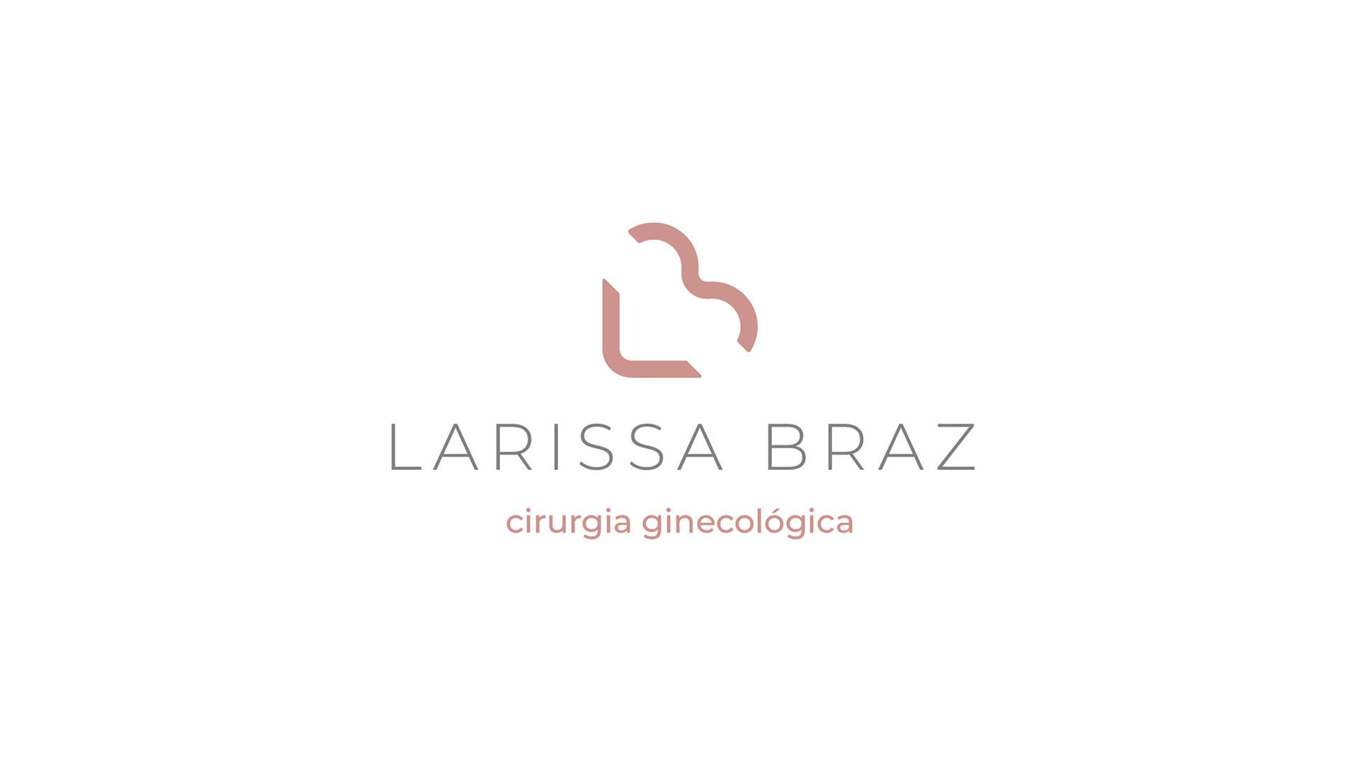
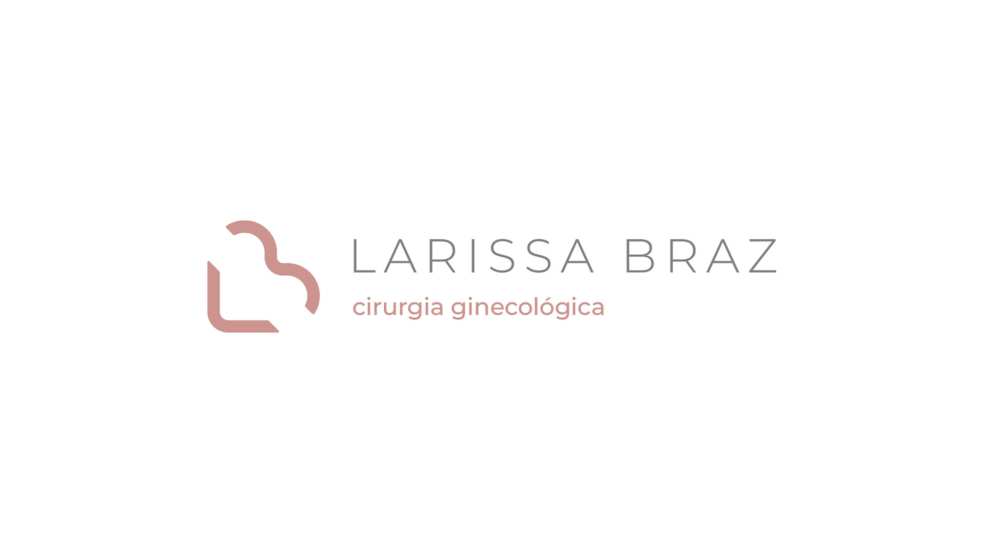


Tive o privilégio de desenvolver a identidade visual da marca Larissa Braz, unindo propósito, estética e significado em um logo que representa muito mais do que apenas um nome.
Neste projeto, três pilares foram fundamentais para a construção da marca:
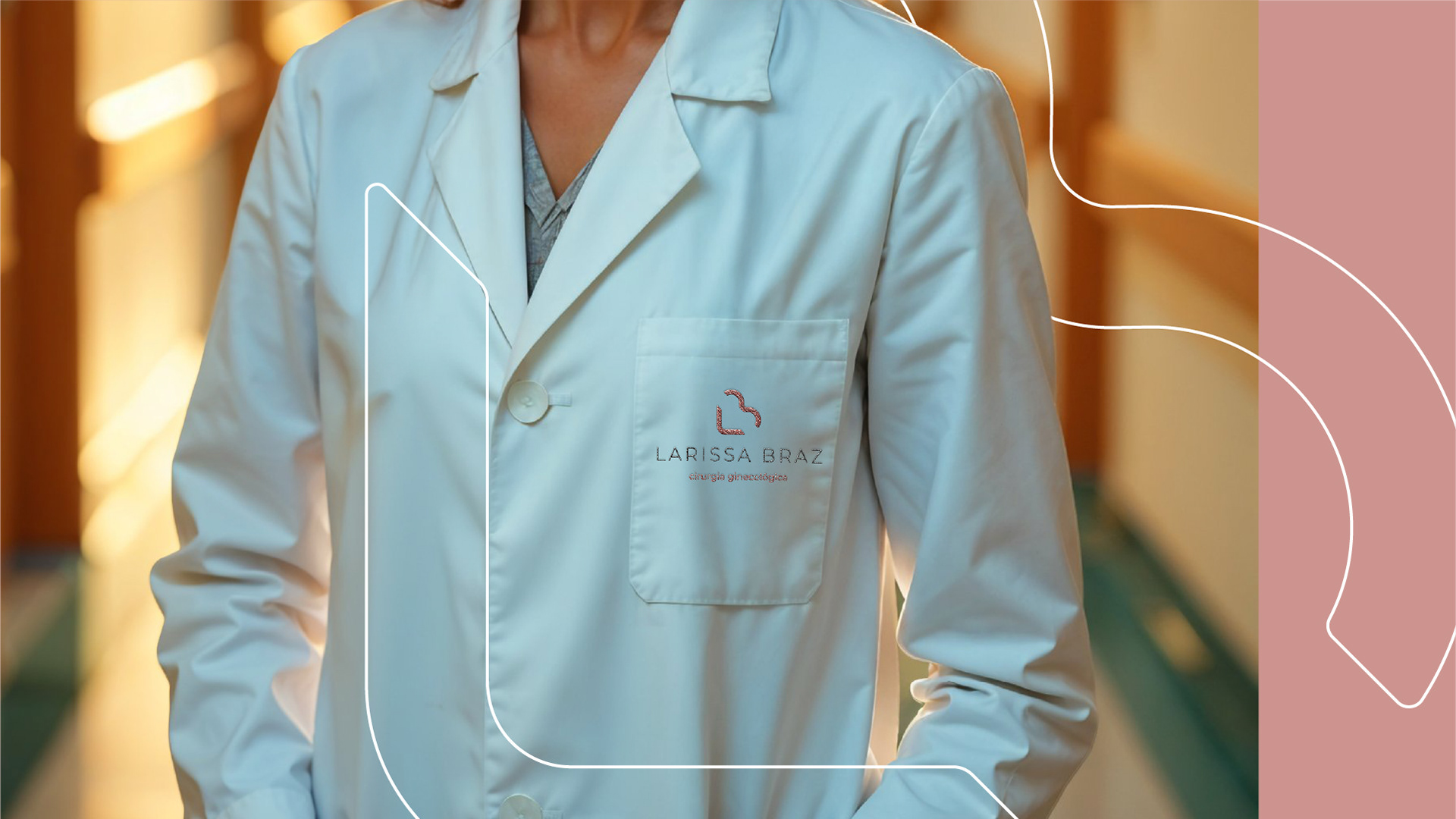
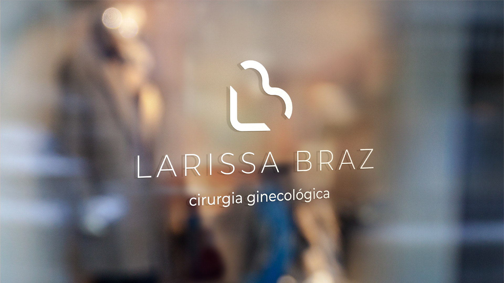
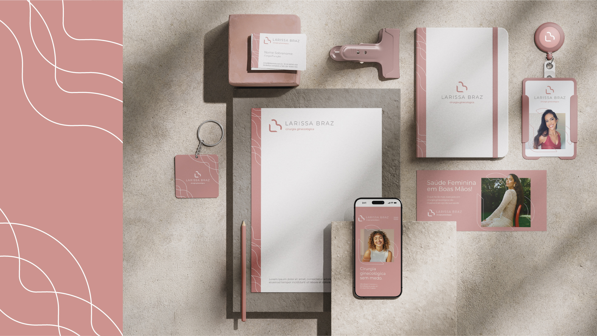
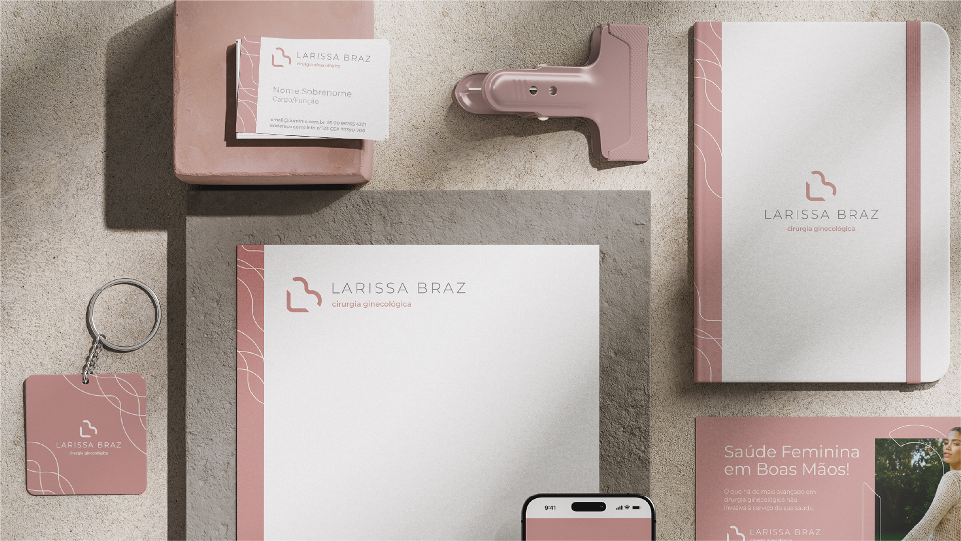
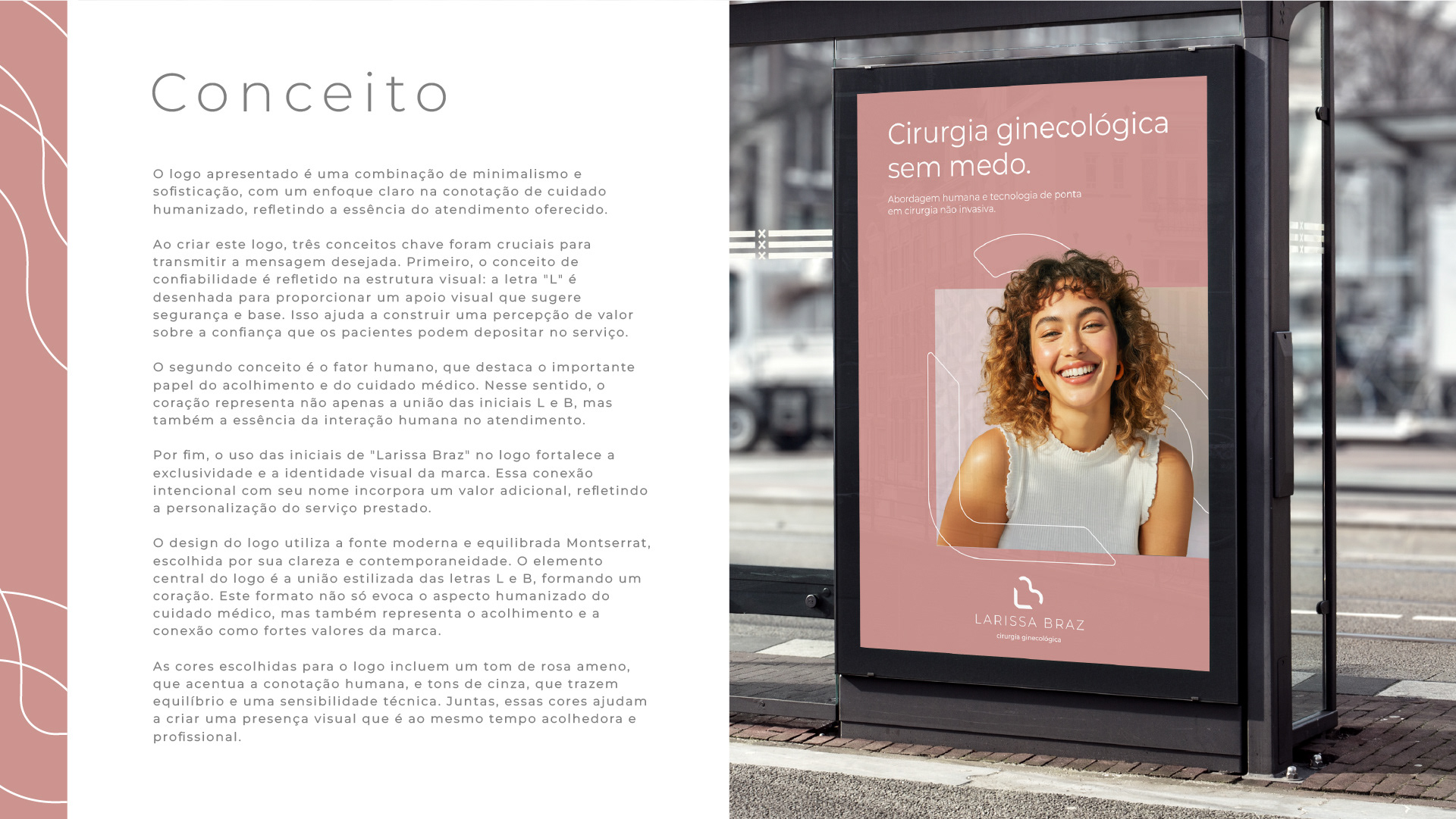
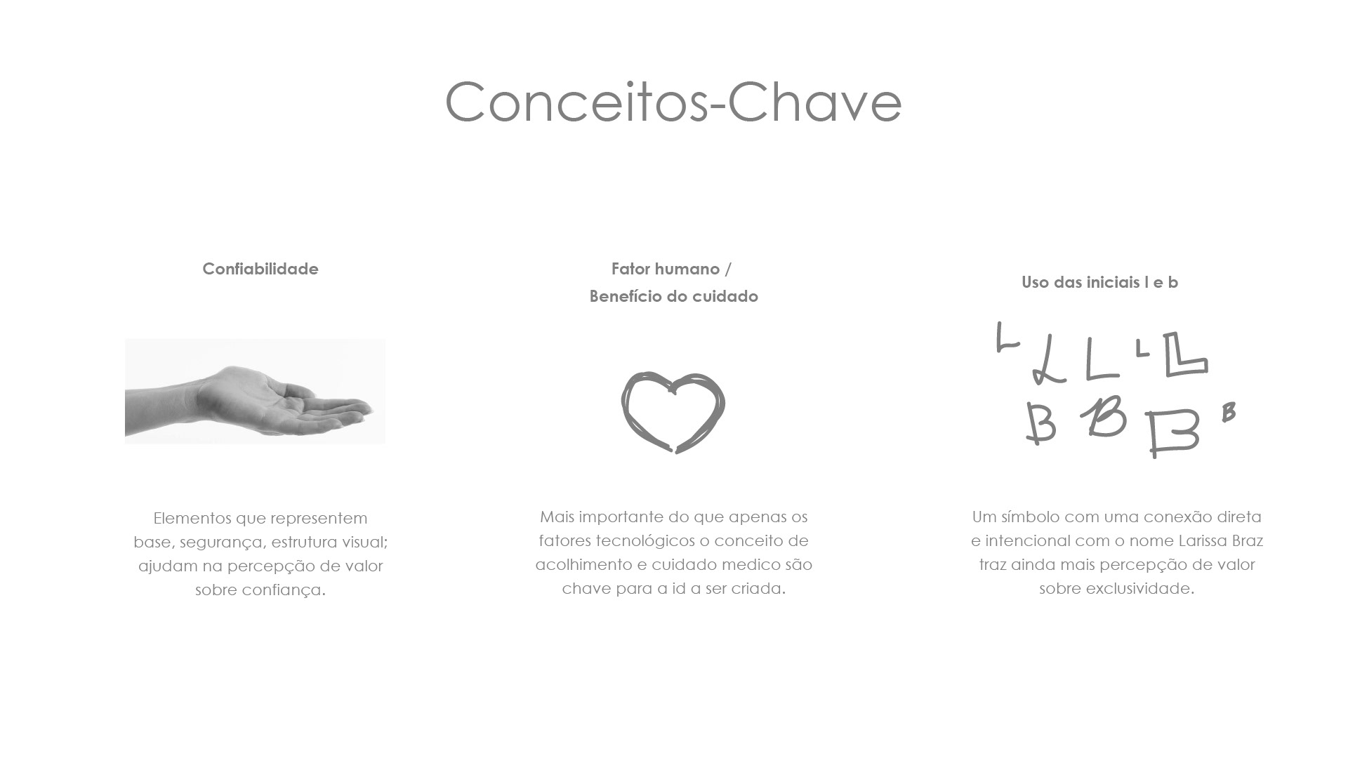
🔹 Confiabilidade: A letra "L" foi desenhada como um ponto de apoio visual, transmitindo segurança e solidez – valores essenciais no cuidado com a saúde.
🔹 Fator Humano: A união das letras "L" e "B" forma um coração, símbolo do acolhimento e do cuidado humanizado que a marca oferece.
🔹 Identidade: A incorporação das iniciais reforça a exclusividade e a conexão com a profissional que dá nome ao serviço, trazendo autenticidade e personalização.
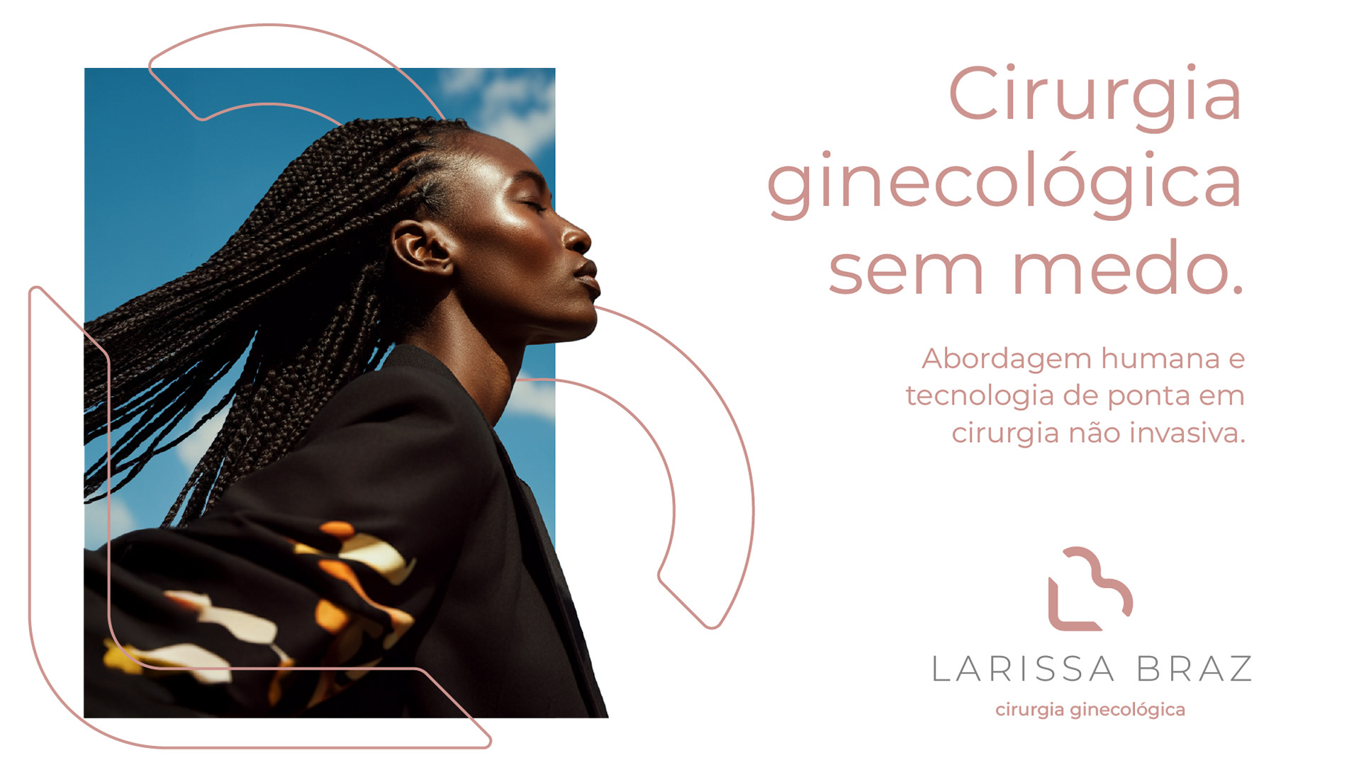
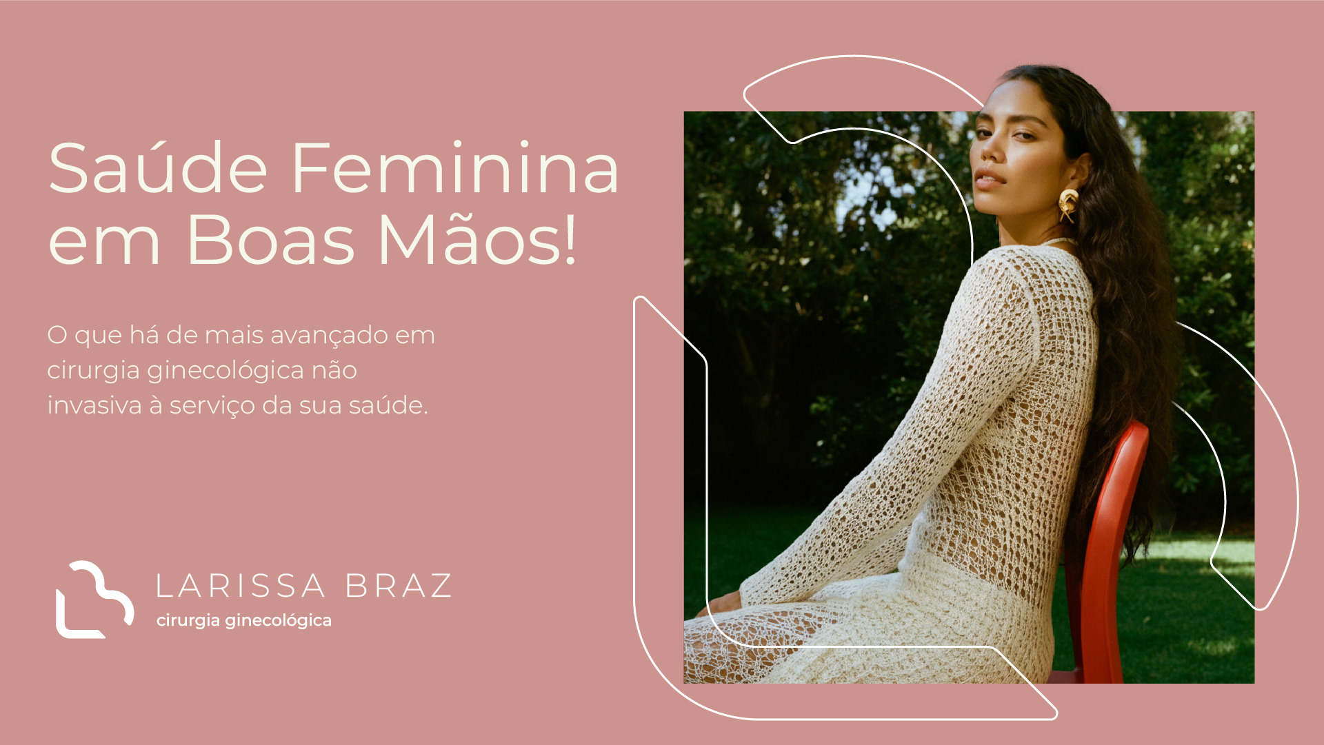
Optamos pela fonte Montserrat, que entrega clareza e contemporaneidade, e uma paleta que mistura o rosa suave (humano e empático) com tons de cinza (equilíbrio e profissionalismo).
Ver esse conceito ganhar forma foi extremamente gratificante. Cada detalhe carrega intenção, cada escolha visual transmite um valor.
🩺💗 Um design que cuida – assim como a marca que representa.
EN
I recently had the opportunity to lead the development of the visual identity for Larissa Braz, a project where design meets strategic branding to communicate trust, human-centered care, and professional excellence.
This brand mark was built upon three core concepts:
Trust & Stability: The letter “L” was carefully crafted to act as a visual anchor, symbolizing support and reliability – key attributes in the healthcare space.
Human-Centered Design: The integration of the initials “L” and “B” forms a stylized heart, reflecting the brand’s commitment to empathy, care, and meaningful patient relationships.
Personalized Identity: Incorporating the founder’s initials enhances brand recognition and reinforces the personal nature of the service offered.
Typography and color were intentionally selected to align with the brand values. We used the Montserrat typeface for its clean, modern look, ensuring legibility and sophistication. The color palette combines a soft pink to convey warmth and humanity with neutral grays to balance with a sense of professionalism and technical precision.
This logo isn’t just a visual mark – it’s a strategic expression of brand values, designed to resonate with both emotional and rational touchpoints of the target audience.
🎯 A brand identity that reflects care, trust, and human connection.